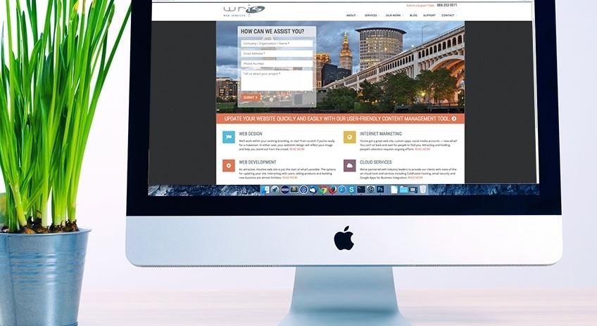
We’ve all done it. Found ourselves on a website that we couldn’t wait to visit only to become increasingly frustrated or confused and then leaving before we finished what we started. Sometimes you are just taking an online quiz about “What TV/Movie High School Would You Attend?” (you know you want to know), but sometimes you are actually trying to do something important and not being able to is, well, annoying.
Here are some ways to ensure you have a good website (and not annoy people), in no particular order.

Design
Design means lots of things. Yes, it means color and layout and images. But it also means organization and structure (more on that below) and the general feeling you get when you see it. If you come to a site and your brow immediately furrows, why would you want to continue? Design is your website’s first impression on a visitor so you need to make it inviting. That might mean bold and bright, or that might mean clean and sparse. Whatever your target audience is, the design of the site should welcome them in like an old friend stopping by for a cup of coffee.
Navigation.
This is how people get around your site. It should be easy, clear, and obvious. That doesn’t mean you need 72 pt. font on a bright red button. But it does mean that if your audience needs to be able to reach you, then a Contact button should not just be a link hidden in the footer. So when you are organizing your site content, think about the path a person would use to get there, and what that is going to mean to your navigation. Don’t break out your information into 15 sections if 6 makes more sense. We always talk about not making someone click too many times to get to what they need, and that still holds true, but forcing them to sift through too much to find what they need can be just as damaging.
Usability.
Along the same lines as navigation, don’t try to be too fancy when it comes to HOW your guests will select the navigation. Have you ever been to a site, trying to get to a page, but instead of clicking the button to drill-down, you have to hover so that the next menu can fly out? And if you move 1 pixel to the right you lose the whole thing? Not good. In this case, 2-3 clicks is much better than the crafty act of menu-hovering, especially if you have a very content-rich website.
Or what about being on a page but having no idea where you are on the site? This sounds silly when typed out but I’m sure you’ve experienced this at least once or twice. One word: Breadcrumbs. Whether your guests follow an easy, intuitive path to their destination or stumble upon it by clicking a link, it’s good practice to let them know where exactly they are on the site. Usability plays into all aspects of your website, so take it seriously.
TLC (Timely, Logical Content) Updates.
You’ve heard this preached ad nauseum by everyone from Google to your mother-in-law (assuming your mother-in-law is a web developer), you have to keep your content current, fresh, and original. How can you expect people to return if they see the same thing visit after visit? You can’t. Which is why updating your website on a regular basis is important not only for your organic ranking, but as a courtesy to your customers. Keeping the website updated shows them that you care about their experience on your site. Because if you are still featuring highlights from your company’s participation in the Spring Marathon, and it’s Winter, well, it sends the message that you just don’t think your site is very important.
SEO (Search Engine Optimization).
Don’t head for the hills when you hear this. SEO doesn’t have to mean a bigger budget. But it does have to mean smart planning. Whether you are building from scratch or redesigning what you have, there are steps you can take in the beginning that will ensure all best practices are implemented on your site so that when you launch you can hit the ground running. And here’s the funny thing...we all know that good SEO helps you with your search engine rankings, but if done correctly, those same things are conducive to user-friendly website. A two-fer. Can’t beat that.
And maybe the most important thing to keep in mind for your website is Common Sense. Think about it. You know the sites that you dread visiting. Don’t do what they do. Create a site that you would want to use. Chances are, if you are happy when surfing your site, your customers will be, too.
If you'd like to learn more about bringing any of the above to your website, we'd love to chat. Just let us know what you're thinking.
Related Blogs
Come See WRIS at the Adobe ColdFusion Summit East

Web ADA Compliance: What You Should Know and How WRIS Can Help

WRIS Employee Showcase: Frank Alvarez, Senior Developer